September 28, 2018
New upgrade to PageUp applicant tracking system
Submitted by Human Capital Services
The design of the PageUp applicant tracking system continues to be updated. The next improvement will become effective in early October.
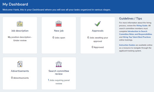
Users will see a modern and simple design to the dashboard or home page. The design update is aimed to increase ease of use for infrequent users.
The bubble view has been updated to include meaningful illustrations that should help guide users. This update will bring more direction and symmetry to the screen. In addition, the help text that was at the bottom of the screen will now move to the right hand of the screen.
An additional update will be to the "My jobs" page.
This update affects those individuals who sit in the "Reports to" and "Hiring Manager" slots on the job requisition — or job card. The drop-down filters have been changed to split controls that should make the available options more obvious. In addition, the page has improved accessibility and responsiveness on all devices.
The next anticipated change will be to the "My New Hires" task list page for HCS liaisons and hiring managers. Watch for additional improvements later this year.


