July 1, 2019
New updates to the applicant tracking system
Submitted by Connie Pfaff-Eickhoff
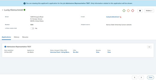
A variety of updates have been made in PageUp, K-State's applicant tracking system, over the past 12 months. The newest update pertains to the Applicant Card. Users can anticipate seeing improvements on Applicant Card user-friendliness, mobile device formatting, and accessibility during the first part of July. A few noticeable changes will include:
- Design standards — PageUp redesigned the Applicant Card to match the color, styling and accessibility of the overall Design Refresh. This change will allow the Applicant Card to better adapt to smaller screens and mobile devices.
- Tabs — The current Applicant Card has a vertical-oriented layout that can get quite lengthy with applicant details, multiple applications, a full history and resume. To improve the ease of use and provide room for more information, the layout will be adjusted to a horizontal-oriented layout. Users should expect to see a tabbed view that allows you to easily switch between different sections of information.
- History section — The History section will be enhanced with a new "infinite scroll" design and purposeful intuitive interaction features. The filters will remain and additional history items are automatically loaded as you scroll.
- The Actions dropdown has been replaced by three dots.

To make the applicant tracking system more mobile friendly, PageUp is reducing the amount of language on standard actions. The Design Refresh is focused on adopting industry standard symbols in the system's iconography making them more simple and easy to understand. The iconography will be changed throughout the entire system and should be noticeable in the new Applicant Card format. Stay tuned for additional improved consistency as the Design Refresh continues through the remainder of 2019.
If you have specific questions, contact Connie Pfaff-Eickhoff with Human Capital Services at 785-532-1730.
