August 6, 2018
Improvements to the PageUp applicant tracking system
Submitted by Human Capital Services

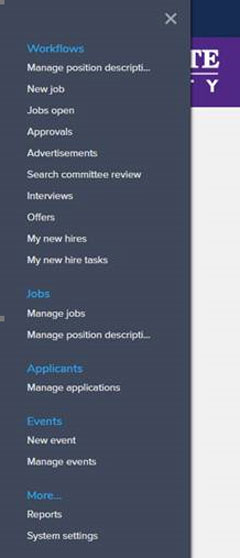
Effective Aug. 8, users will see a modernized navigation approach to the applicant tracking system's homepage and menu. This approach will create a more consistent and simple experience across all devices — desktop, laptop, tablet and cellular phone. The menu — referred to as the "Hamburger" — is moving to the left side of the homepage and will no longer include the bubbles.
In addition to the menu relocation, the PageUp logo is replacing the "home" text like other websites such as K-State, Google, Netflix, Facebook or YouTube.
Recent Items Menu is now limited to 15 to align with the principle of "touch first" design. The space between the menus' items has increased to ensure easier access on desktop, mobile and tablet devices.
The next anticipated change will be to the dashboard. Watch for updates later this year.
