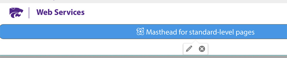
Masthead component example
When to use standard-level
The majority of pages are standard-level pages with a left menu and main column content. Many of the same features are available on these pages, including brag panels, disclosures, and positioned images.
Component library for standard pages
The following are available components to use in the K-State CMS on standard-level pages. Click the Insert Component button from the toolbar while in Edit Mode, and select the preferred component.
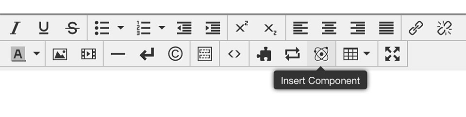
To edit a component, while in Edit Mode click the component to select it, then click the edit pencil at the bottom.
Disclosure
- Inserting it into a page provides seperate editable regions that can contain text, images or other content.
- Optionally, it can be set to be open or closed on page load.
Instructions for inserting a disclosure
Icon feature
This infographic component is best used for showing statistics and accolades. Each panel can have an associated link. There can be 1-4 sections, but 2 works best on a standard-level page, and 3 on a high-level (full-width page). The panel is not meant to be used as navigation.
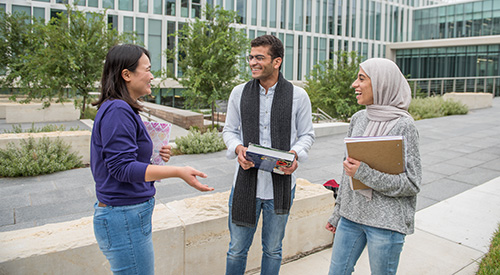
Image - large feature with overlay
Image size: 960 x 540 pixels
Useful for featuring an important piece of content. Options include:
- Image positioning
- Text description
- Icon
- Linked button with text
Headline
Text: Lorem ipsum dolor sit amet, consectetur adipiscing elit.
Video - feature with overlay, mp4 or YouTube
Image size: 960 x 540 pixels
Options include:
- Video can be either mp4 or YouTube
- Headline and text can be included and positioned on either size
- Linked button with text
Link - arrow
Use this link to help links stand out on a page.
Link - button
Use the button for links that request an action, apply, submit, etc.
Highlight - boxes with images
Image size: 600 x 330 pixels
- Highlight and link sub-topics anywhere on the your pages.
- This feature can have two, three or four panels. Two or three panels fit best on standard-level pages. They adjust to screen size.
- Options include image, title, description and link with white or gray background.
Brief intro to linked content.
Brief intro to linked content.

Brief intro to linked content.
Related-program boxes
Image size: 450 x 300 pixels.
Highlight programs anywhere on the your pages. This feature can have up to three panels. Two panels fit best on standard-level pages.
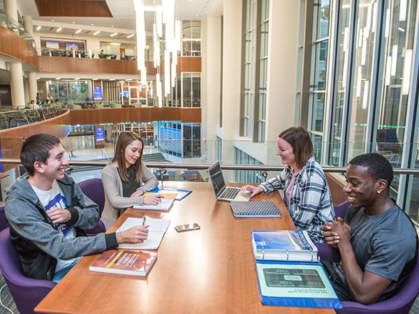
Image - Positioned
Image size: 600 x 600 pixels
Easily float content left or right and text will automatically flow around it.
Lorem ipsum dolor sit amet, consectetur adipiscing elit. Vivamus ut purus tincidunt, luctus lacus a, pellentesque velit. Nam tincidunt fringilla luctus. Quisque ac cursus tortor, id luctus odio. Ut ac dictum velit, ac lacinia odio. Nunc semper eleifend sem scelerisque feugiat. Maecenas sit amet mi massa. Nulla pharetra metus massa, vel pretium eros fermentum vitae.
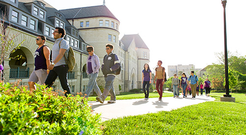
Image - full width, with caption
Image size: 960 x 540 pixels
Useful for including a full width image with caption. Options include:
- Image scaling. Image will expand to fit the full width of page.
- Text caption
- Optional photo credit