
High Level Masthead Title
Subheading description for the high-level marketing page. Masthead images should be 1600 x 650 px. Height is variable based on image content and focus.
When to use high-level
High-level pages are the top pages linked from the main menu. These pages use the same features as the homepage template and are intended to promote the most important topics. For example, the Academics high-level page for each college would use components to highlight the academic benefits of the college, clicking through to the topics. For the best user experience, any pages following the high-level page should be standard-level page types.
High-level page component library
To select a component and insert it into the page, click the Insert Component icon in the toolbar while in Edit mode and select the component from the list.
To edit a component, click the component to select it, then click the edit pencil at the bottom.
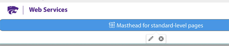
Masthead - high level
Image size: 1600 x 650 pixels.
View more details about mastheads.
Yellow box navigation
The navigation boxes above are optional for high-level pages. These are based off of the sub-navigation items for that tab and will be the same as in the dropdown on the homepage. You can add or remove them in the page's Properties.
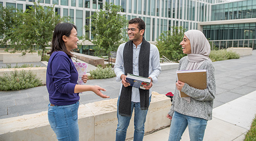
Image - positioned
Image size 600 x 600 pixels.
Below is an image positioned left. The text automatically flows around it. Images can be positioned left, right or full screen.

Heading 2 headline with Image - positioned
On the left is a component called image, positioned. You can position the image left, right, or full.
The image should be square 600 x 600 px. But will assume 600 px wide by the corresponding image height.
Link button (below) can be used in place of a standard link to stand out.
Icon feature
This is best used for statistics and accolades.
- It can have 1-4 panels, works best of a full-width page with 3 panels.
- Icons are selected from a dropdown in the component insert screen.
- When used above an Image with overlay it blends in to the top of the image.
- Should not be used for navigation.
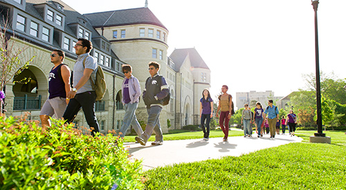
Image - large feature with overlay headline
Recommended image size is 1600px wide by 1000px high.
Image - large feature with overlay
Image size: 1600 x 1000 pixels
The image about is a full-width feature image with heading and subheading. Options include:
- Heading and sub-heading text
- Linked button with text
- Text location options left, right, center left, and center right.
Image - full width, with caption
Image size: 1600 x 1000 pixels
Useful for including a full width image with caption. Options include:
- Image scaling. Image will expand to fit the full width of page.
- Text caption
- Optional photo credit

Link - arrow
Use this link to help links stand out on a page.
Link - Button
A button should be used for a call-to-action such as Apply, Register, etc., and not for standard link text. Buttons indicate action.
Highlight - boxes with images
Image size: 600 x 330 pixels
- Highlight and link sub-topics anywhere on the your pages.
- This feature can have 2, 3 or 4 panels. Panels adjust to screen size.
- Options include image, title, description and link with white or gray background.
Brief intro to linked content.
Brief intro to linked content.

Brief intro to linked content.
Video - feature with overlay - YouTube or MP4
Image size: 1200 x 800 pixels
The video with overlay plays in the page. The overlay is a keyframe image that promotes the video. Options include:
- Select between mp4 and YouTube videos
- Headline and sub-headling text
- Text placement left or right side
- Button link with text
Disclosure
Each instance of this component is a single disclosure.
- Inserting it into a page provides seperate editable regions that can contain text, images or other content.
- Select a unique numbered identifier for each disclosure.
- Optionally, it can be set to be open or closed on page load.
- After inserting the disclosure, save the page. Then open the disclosure and click the green Edit button to insert text.
Instructions for inserting a disclosure
Image - quote panel
Image size: 300 x 450 pixels
These work best with two quotes. Options include:
- Headline one and two, Image and Quote Panel in this example
- Image for each quote
- Options include quote, attribution, and button link
- Can be used nicley without the image
Related programs boxes
Image size: 450 x 300 pixels.
- Highlight programs anywhere on the your pages.
- This feature can have up to three panels. Two or three panels works best on a full-width page.
- Options include, title, description and link
- This is not a navigation structure, but it can be used to highlight and link to topics.
The CTA layer
The call-to-action layer (below) links to central pages for Apply, Request info and Visit. If a chat is available, the visit link can be switched to the Chat option during chat hours. See K-State Online's example, which says "Chat with us".
The CTA layer is turned on by clicking the checkbox in properties when the file is checked out.
The CTA layer should only be turned on when it's contextually appropriate -- on pages that would typcally be in the path of a future student. For example, degree program pages and scholarship pages. Overuse of CTAs can cause users to ignore them.