March 23, 2021
A closer look at CASE awards: Enrollment and recruitment creative work
Kansas State University continues its award-winning communications and marketing work to highlight K-State and recruit prospective students.
As part of the strategic enrollment management initiative, the Division of Communications and Marketing recently received nine District VI awards from the Council for Advancement and Support of Education, or CASE. The nine awards were among the 42 total awards that Kansas State University received for creative work. Many of the award-winning projects were collaborative efforts among the Division of Communications and Marketing and other units.
A prestigious grand gold award went to the new K-State website to help prospective students find academic interest areas, programs and degrees. The grand gold award was in the digital communications-institutional websites category. CASE grand gold awards recognize entries that are "extremely exceptional or game-changing." Grand gold awards are rare and are the highest level of recognition in the program.
"The academic interest areas web experience is truly the result of applied expertise across the institution," said Ashley Martin, assistant vice president for communications and marketing. "From establishing the back-end framework in partnership with the Office of Recruitment and Admissions to vetting optimized content in partnership with the university’s academic units, the project demonstrates how institutionwide collaboration can bring big ideas to fruition and empower our web and marketing teams to create the best possible user experience."
The other eight CASE awards for enrollment and recruitment creative work included three gold awards, four silver awards and one bronze award.
The CASE award judges offered the following feedback on the awards.
1. Grand gold — "Academics Project: Interest Areas, Program Finder, Undergraduate Degree Guides" in the digital communications-institutional websites category.
From the judges: "Everything from the layout to graphic design and student diversity representation was well done and easy to navigate. This is a massive undertaking: lots of planning to get it right with so many moving parts. The site was well-written and targeted for prospective students. Great use of graphic design, responsiveness, and SEO organization to pull the visitor into the information to explore further."
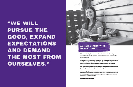
2. Gold — K-State viewbook in the multipage publication design category.

From the judges: "Fantastic inclusion of alumni and current students in the New Student Services Viewbook. Fabulous job of highlighting the benefits early on in the experience at Kansas State University. Pictures reinforce brand. Credits to the 'Return on Investment' and 'Check List' for students page. Really liked the tag-line on the title page and the colored/painted look of the heading text. It contained all of the informational items you would expect, while incorporating a call to action. Great use of black-and-white photography to add drama. Consistent in look, feel and message. Design conveyed a message of energy and change, and makes the reader want to take action."
3. Gold — "Graduating in Just Three Years" in the student recruitment long video category.
4. Gold — K-State Online website in the digital communications-institutional websites category, created in partnership with K-State Global Campus marketing staff.
From the judges: "A very nice site that is easy to navigate and understand, with all important items at the top for desktop and for mobile. There is consistent use of templates throughout. This is a very clean site that is clearly targeted toward adult learners. Every category is clearly labeled and user-friendly, and the branding ties in nicely with the design."
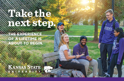
5. Silver — K-State student mini viewbook in the multipage publication design category.

From the judges: "Love this piece. Very effective for giving students answers to those initial questions. The New Student Services B&D Student Mini-Viewbook speaks to the students from the 30,000-foot view and narrows in on programs, careers, etc. The inclusion of the community of Manhattan was nicely folded into the piece. Well done and a great extension after their acceptance from admissions. Photography featuring students and campus successfully created a real-life view of campus life. Nice use of info-graphics to efficiently and effectively share data."
6. Silver — Admitted student welcome letter in the single-page publication design category.

From the judges: "Love how this is a piece that represents pride and a belonging. Great idea! A piece that can be saved and treasured for many years. Great idea adding social media to the print material. Piece is on brand, simple and impactful. Clever use of one piece for two purposes. Creates a celebratory feel, and the poster extend the viewing life of the piece."
7. Silver — "Don't Make the World Wait" university branding campaign in the marketing-institutional branding programs category.
From the judges: "Overall, this was an impressive and daunting university rebranding project during a challenging time. The general look helped to define their new focus, and the related pieces were integrated successfully. The new theme and related values were done well. The outcome was impressive, given the task of unifying four separate campuses under one brand."
8. Silver — Gerontology program graduate student recruitment video in the student recruitment short video category.
From the judges: "Enjoyed the unique perspective of a mature adult."
9. Bronze — "Don't Make the World Wait" video in the institutional PSAs and commercials category.
From the judges: "Great diversity in programs and students appeals to all audiences. The viewer can see themselves there."
